JUPITER HAMMERHEADS REDESIGN
New logo
2 ticket designs
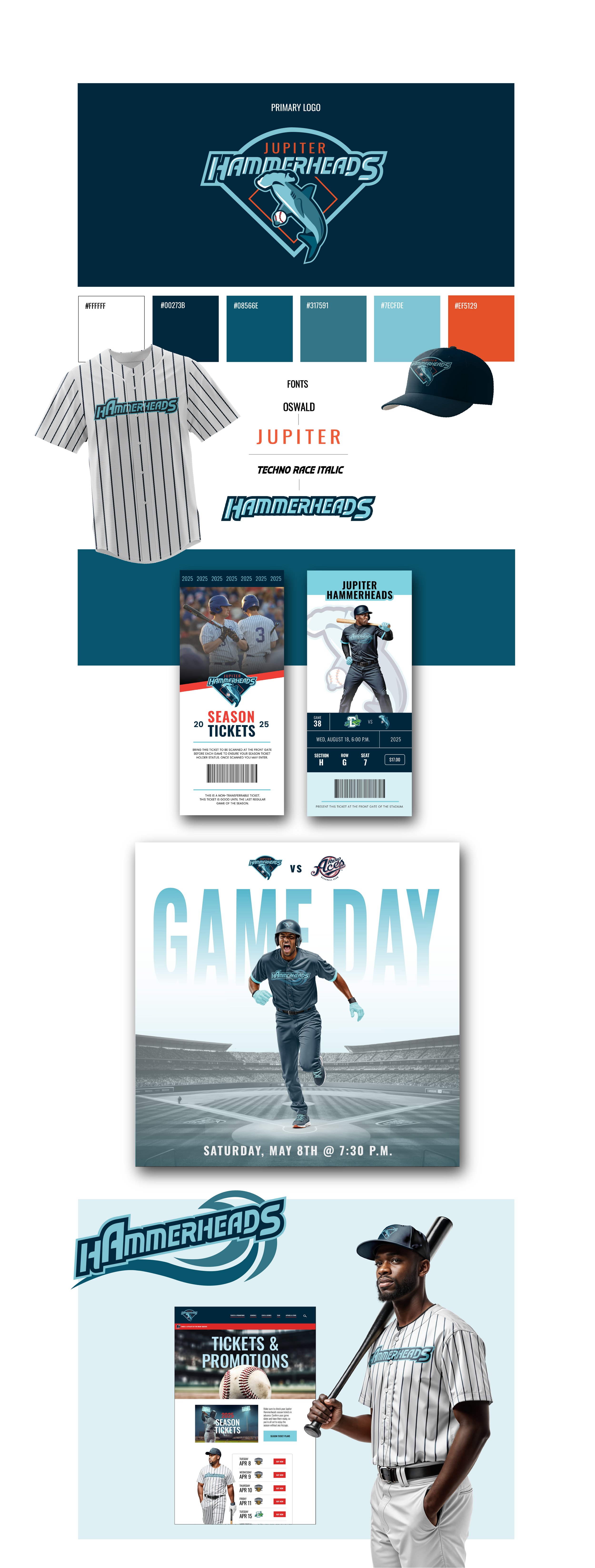
New uniform design (3 uniforms)
3 social media post designs
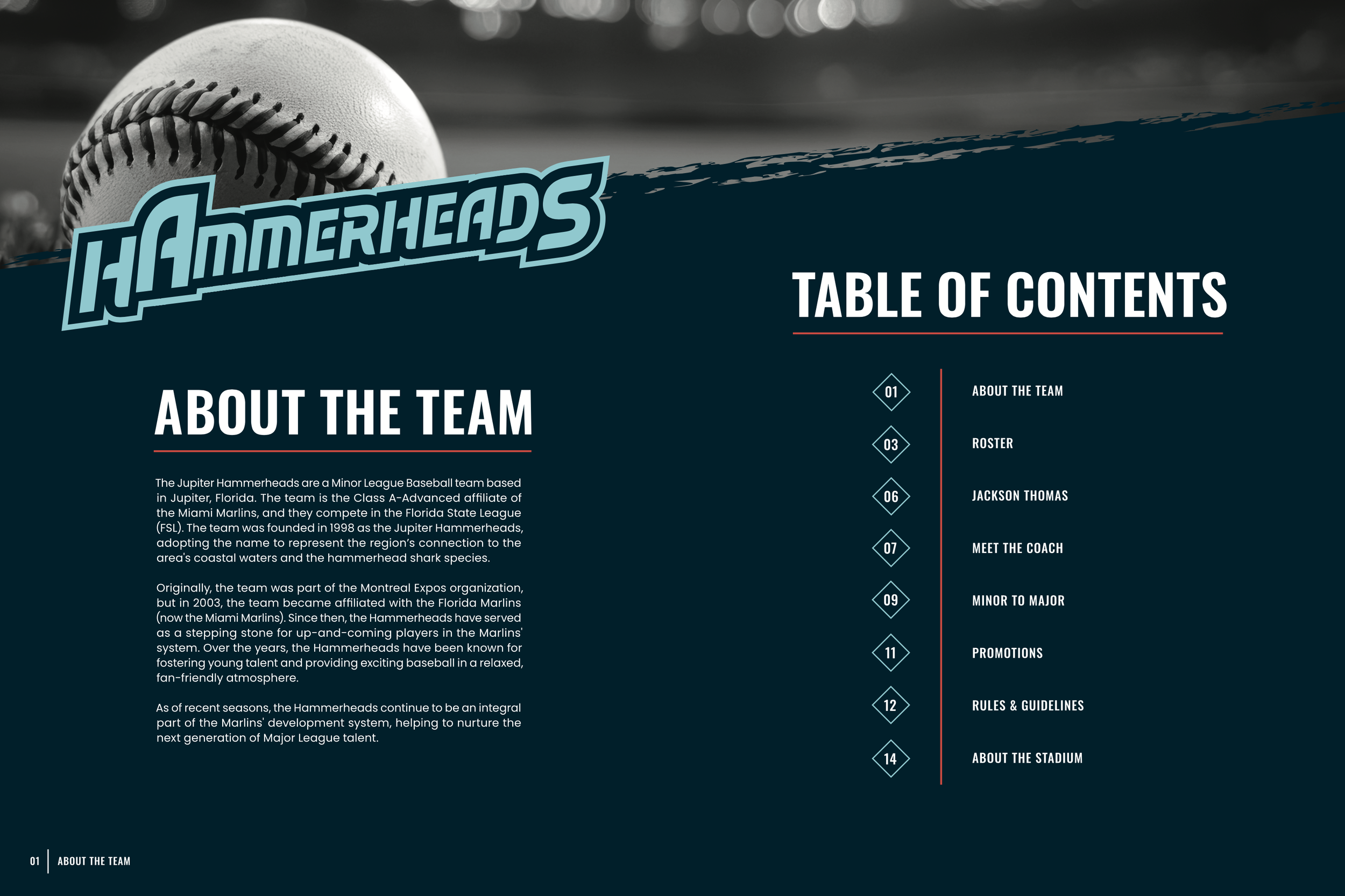
Sports booklet (14 pages)
Website
DELIVERABLES
JUPITER HAMMERHEADS
The Jupiter Hammerheads are a Minor League Baseball team based in Jupiter, Florida. They are a Class A affiliate of the Miami Marlins, playing in the Florida State League. Known for their fun and engaging atmosphere, the Hammerheads are a beloved local team, offering fans the chance to watch up-and-coming talent in action. The team’s name and logo are a nod to the area's coastal location and the hammerhead sharks that inhabit nearby waters.
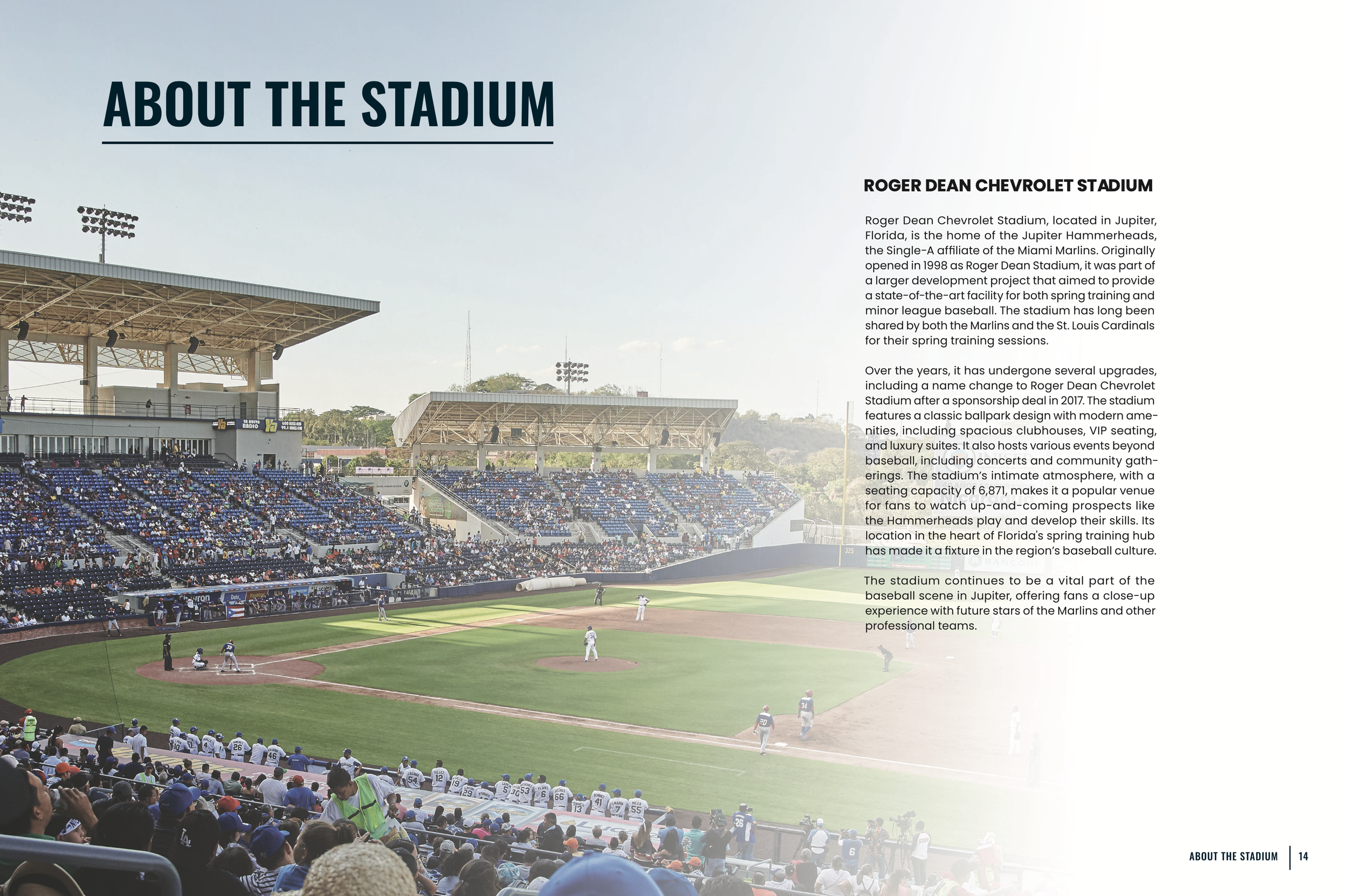
The Jupiter Hammerheads play their home games at Roger Dean Chevrolet Stadium, which they share with the Palm Beach Cardinals. This ballpark is known for its scenic setting and family-friendly environment, with a variety of promotions and events throughout the season. The team has become an integral part of the local community, providing entertainment and a sense of excitement for baseball fans of all ages in the Jupiter area.
HAMMERHEAD GRAPHIC
The logo for the Jupiter Hammerheads has not changed since the team was formed in 1998. I wanted to create a new logo for the team that felt very fresh and modern. I wanted to simplify it and create an exciting logo that captured the environment of the sports world. I started with sketching a hammerhead shark, and trying to add highlights and shadows throughout the process. I also was experimenting with the fonts used, the outside shape of the logo, and some of the colors. I eventually tweaked it until I felt it captured the essence of a minor league baseball team, while making it new and alive.
After the above process, for the final logo I finalized the sizing for the word Jupiter, and changed some of the outlines and strokes into the lightest blue color instead of white to make them more cohesive and less like separate parts. I also adjusted a couple of colors, made the eye of the shark larger to draw more attention to the face, and fixed up the fin on the front of the shark so it felt more apart of the shark’s body.

PROPOSAL
The Jupiter Hammerheads are a Minor League Baseball team and are the Single-A affiliate of the Miami Marlins. They are located in the town of Jupiter in Palm Beach County, Florida, and play their home games at Roger Dean Chevrolet Stadium, which opened in 1998. The name “Hammerheads” was given to the team after the owner took surveys and asked local school kids which shark they liked the most. After the kids’ votes, the owner decided on the name “Jupiter Hammerheads.”
The Hammerheads have not changed or updated their logo since the team was formed in 1998. The logo looks very outdated, and needs to be more modern to compete with the other minor league baseball team logos. Along with their logo, their overall brand and website is in need of an update and redesign. My goal is to redesign their logo, create a player program, create social media posts, redesign their uniforms, design a game ticket, and redo their website. The overall brand will feel very fun, cohesive, and exciting. It will reflect the lively environment of the sports world.
TARGET AUDIENCE
The target audience for this project is U.S. baseball fans. Specifically, baseball fans who follow minor league baseball. Over 75% of Americans live in a market with a minor league baseball team. The target audience age is a wide range, as this brand can appeal to kids, as well as adults. In the year 2023, an estimated 35,515 people attended the Jupiter Hammerhead’s games.
RESEARCH SYNOPSIS
My research for this project included a lot of things. First, I researched other minor league baseball logos that were more successful and tried to see what type of design aesthetic fits well for a minor league baseball team. I wanted to see what was currently out there to see which logos were more successful versus the ones that are not as successful, to give me a good idea of where and how to start on a completely new logo.
I also researched current sports design. Components such as publication, websites, social media posts, tickets, and more to get some ideas of what is currently popular and also successful in the world of sports design right now. Additionally, balancing that with some different and new ideas I had for the redesign as well.
Along with that, I researched the current Jupiter Hammerheads’ website to see what I could improve specifically on when doing my own website for the redesign.
LOGO PROCESS
SOCIAL MEDIA POSTS

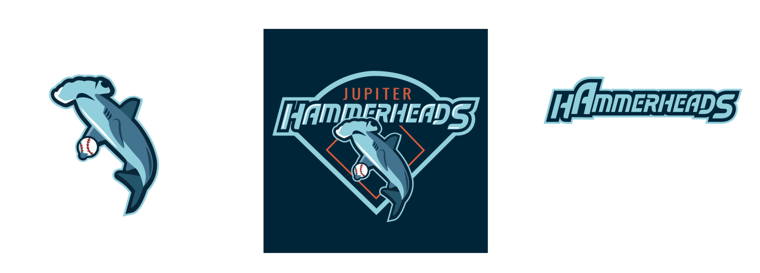
HAMMERHEAD WORD MARK

AWAY JERSEY
Designing the tickets was something that was very fun to me. Tickets are not designed to look as exciting as they should be most of the time, and yet, a nicely designed ticket is super cool to receive. I wanted to create two different ticket designs, one season ticket, and one single game ticket. I wanted to use photography, nice type, and graphics to make a usually very boring object more lively and exciting, reflecting the excitement of going to a game.

For the social media posts, I wanted to create a set of three posts that felt super cohesive with each other, the brand, and made the Hammerhead online atmosphere very exciting. The posts highlight players, accomplishments, and upcoming games to look forward to.
OBJECTIVES
To independently research, design and produce a logo, website, player program, ticket design, uniform design, and social media posts for the Jupiter Hammerheads.
To research the minor league team the Jupiter Hammerheads and learn about their existing brand, and research sports branding and design.
To apply the critique I receive from classmates and professors, and apply the design knowledge I have to all aspects of the project.
To maintain organization and good time management throughout the whole design and production.
To expand my experience working with many medias, such as illustration, photography, typography, and web design.
To produce a cohesive, successful brand across all deliverables, which is an improvement from the current team’s brand design.

FINAL LOGO
HOME JERSEY

OTHER BRANDING ELEMENTS
Here are some other brand elements I used throughout aspects of my senior project. I used the graphic of the shark alone as a fun way to get the branding across, along with a hammerhead word mark where I extended the letter “A” to make it look like the fin of a shark. The word mark was another item I used throughout branding, and this mark was used on two of the uniforms as well.
LOGO WITH NAVY BACKGROUND
BASEBALL UNIFORMS
I wanted the uniforms to display a variety of styles, so I designed the home, alternate, and away jersey. The home jersey uses the classic pin-stripe look that so many beloved baseball teams use as their home jersey. It also uses the word mark “Hammerheads” across the chest. The alternate jersey is a more colorful option, and also uses the “Hammerheads” mark which has a subtle wave graphic behind it. The away jersey has a bit of a different design, although it is still taking parts from the logo and branding. It has the words “Jupiter” across the chest as most baseball teams have a jersey that has the city name on their jersey instead of the team name.


ALTERNATE JERSEY
BASEBALL TICKETS


SPORTS BOOKLET
The booklet for the Jupiter Hammerheads is a nice short 14 page booklet, to give more information to people attending a game about the team, stadium, promotions, and more! I wanted this booklet to be super lively, on brand, and a nice publication piece for the project.
WEBSITE
The website includes a lot of pages, such as tickets and promotions, schedule, stats and scores, team, and apparel and store. I wanted this website to be super easy to navigate, while also using a lot of images and type overlapping, to create a more interactive and lively experience for the user. Although this website is just a prototype, most buttons actually go to the according page, so have fun and feel free to navigate through the website below!